
Introduction:
Painting can be great. It beautifies your home. To paint well, you must know the colors. You must know the type, shades, and warmth of the colors. You should also know the vibe a color gives.
It can look like a big task to choose a color. Especially if you’ve spent hours painting the wall, only to find it’s the wrong color.
Before you conclude in selecting a color for your house, you have to consider the following practices.
Don’t Choose Paint First
It sometimes looks like you should select your color first because painted walls make up some of the decor space in your home. But, it’s easier to pick one of thousands of colors to match your decor than to find decor to match a paint color.
It’s fine to start your design process wanting pops of color. But choosing your paint color should be the last step. First, look for inspiration for your room, be it in a family painting or a textile you love.
Choose your fabrics, furniture, and major accents first, and then think of how they all come together.

You can read more about “the process of home finishing” here.
Take Note Of Permanent Features
Before you lift a paint palette, look around your house and record its permanent features. Are there dark-stained wood floors, exposed beams and pillars, or a brick fireplace?
Are you planning to make any permanent changes shortly? The tone and hue of all these elements should be seriously considered before you progress with your design.
Choose Colors That Matches Your Home’s Furniture And Fabrics
It is easier to start by placing the furniture and decor. Then, select wall paints to match. Besides testing the paints on the walls, check them against the furniture and other elements in the space.
Paint a small poster board. Then, hold it up to the furniture and fabrics. This will show you how well they match.
Pick The Right Paint Sheen.
Another thing that affects how your paint color will look is the sheen. In general, the higher the sheen, the easier it is to maintain cleanliness.
Unfortunately, the higher the sheen, the more imperfections will appear in your home space. So, if you’re trying to mask any imperfections in your walls, go with as little sheen as possible.
Here are some general guidelines for the different finish choices:
A. Gloss is highly wipeable and easiest to clean, but it is way too shiny for walls. Gloss is best for baseboards, trim, and sometimes cabinets. It gives an almost glass-like finish and is perfect for high-use surfaces (like railings) or furniture.
B. Semi-gloss will be almost as easy to clean. It will be less shiny, but it’s not good for walls in large spaces. Semi-gloss is great for trim, cabinets, and high-moisture areas, like bathrooms.
C. Satin has a bit more shine and works well in high-traffic areas like hallways and kids’ rooms or areas that have moisture. It is also super cleanable, which is why it is perfect for kitchens and bathrooms.
D. Eggshell is more durable than flat or matte paint. Use it in high-traffic areas, like living and dining rooms. In my experience, most scuffs can be cleaned off this surface with a damp cloth.
E. Flat or matte is best in rooms where the walls won’t be touched often, like master bedrooms. It doesn’t shine at all. It is also perfect for low-traffic areas such as living rooms, bedrooms, and ceilings.
Understand Wall Paint Undertones
Your painted walls may not match your expectations. All paint colors come from other colors. They also have a warm or cool undertone.
A warm paint color will have a base color (undertone) of a warm color, such as yellow or red. A cool color will have a base color (undertone) of a cool color, like blue, green, or grey.
Make use of the darkest color on the strip to find out the true color. This will save you from ending up with color that is too pink, too blue, too yellow, etc.
Understand the differences between a warm undertone and a cool undertone. Analyze the impact of the undertone on the entire look of your interiors before you decide on one.
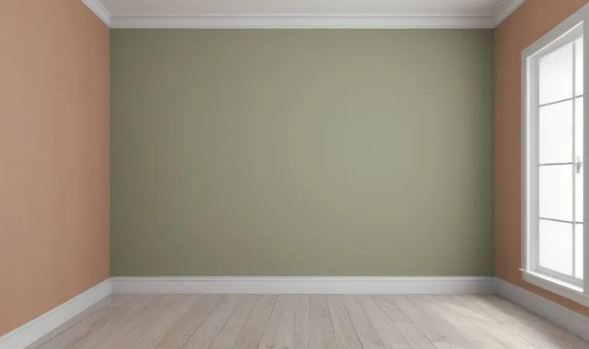
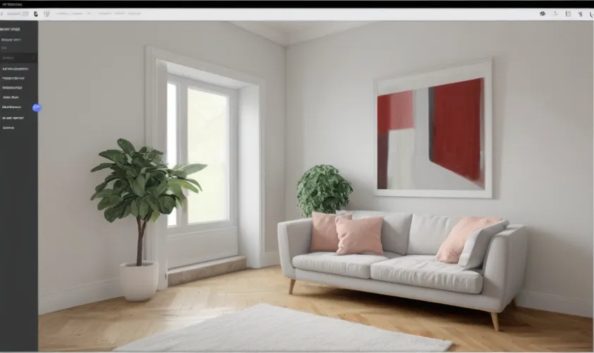
Stick With Neutrals For Walls
A striped wall in neutral colors adds tons of style but still keeps the room looking relaxed. Neutral wall color with a pastel ceiling is a sneaky way to add color without losing the soothing vibe of the space.
Know where you want the attention in a room to be. If you want the greatest attention to be on the walls, then you can go for bold, vibrant colors.
If you want the focus to be distributed around the décor of the room, go for mild, neutral colors with minimal designs.
But, for most of us, it’s best to keep the walls neutral and use those bold pops of color for accents and accessories.
I recommend going with neutral walls for a few reasons:
A. Medium-toned neutral walls are good for families because they hide scuffs and dirt quite well.
B. If your walls are neutral, your attention is on the furniture and accent pieces rather than on the walls. Which is definitely what you want!
C. If your walls are neutral, you can change out the accent pieces easily if you change your mind about the colors you like. It does happen!
D. Neutral-colored walls also make it easy to swap out your décor with the seasons, or even add holiday and seasonal touches.
Test Your Paint Colors Before Committing
Buy tester paints in a few colors/shades, paint a large area on a few different walls, and see how the light hits it at different times of the day.
By doing so, you can get the best interior wall paint ideas for your home that will look good in the room at all times of the day.
Always sample any color you’re considering. Before committing gallons of paint and hours to your project, you must get the painting right the first time.
You don’t want to skip this step. If you look at the back of the paint store, there are stacks of cans of returned paint from people who did not take the time to sample first.
Buy testers in small color shades. Paint a big enough area on a few different walls. This will let you see how the light hits it at different times of the day.
Try your best not to test your paint against white walls because it will throw the color off. If you have to, do a larger test area to get a better feel.
Almost all the brands now have testers ready for a few bucks. It is well worth spending the money to buy small to test in your space before purchasing gallons of the color.
Plus, the leftover samples are great for touch-ups and other small painting projects.
Consider A Consistent Color Theme
I don’t mean you must paint the whole house the same color. But, in rooms that open into one another, consider how each room will look from another.
If you want to play it safe and use one color, try going a bit lighter or darker in one room or on a focal wall. It’s a great way to add depth and interest to a space.
Model homes are a great example of having a color theme throughout a home. They typically keep the main living space wall color-neutral and use fabrics and accessories to add color.
In the bedrooms, use the living space’s accent colors on the walls. Keep the bedding neutral. Of course, kids’ bedrooms don’t always follow this rule.
You don’t want to paint your entire home one color. But, for a cohesive flow, don’t choose colors in isolation or one room at a time with no plan. You need a whole-home color palette.
A whole-home color palette will guide your home’s colors. It will also let you use those colors in different ways in each room.
It is good to experiment with several colors, but don’t forget that every space in your home must connect.
Have consistency in the basic color theme for your interiors. Choose the best interior wall paint colors that will complement each aspect of your interior space.
Get To Know The Color Palette.
The color wheel refers to the arrangement of colors according to their shades in the color palette. You can find the color red gradually moving to shades of colors like pink and orange.
The same goes for the arrangement of other colors. The best pick for interior wall paint colors and designs would be to follow the color wheel in your color combinations.
To find colors that complement your chosen fabrics, finishes, and furniture, use a color wheel. “Opposites attract” is true for colors, too. Hues opposite each other on the color wheel are complementary.
Treat Your Ceiling As Your Fifth Wall
To give low ceilings the illusion of height, paint them white. Also, paint any crown molding the same color as the walls. This will keep you from interrupting your gaze upward.
“Ceiling white” always makes a space feel airy. But a lighter shade of the wall color can achieve a similar effect. Take the paint sample card that has your wall color as the middle option, then go one or two choices lighter for the ceiling color.
The result will be a room that appears larger because the contrast between wall color and ceiling color has been softened. For small rooms, like bathrooms, the ceiling can be painted the same color as the walls to make it look bigger.
Conclusion:
The easiest way to select the best interior paint colors is to start with the colors you like. When you start with the colors you love, you are not limited to traditional color schemes for a particular decorating style.
Using your favorite color as your base color, you can create a color scheme around it. Your favorite colors can be the perfect inspiration for your new color palette for the whole home.